

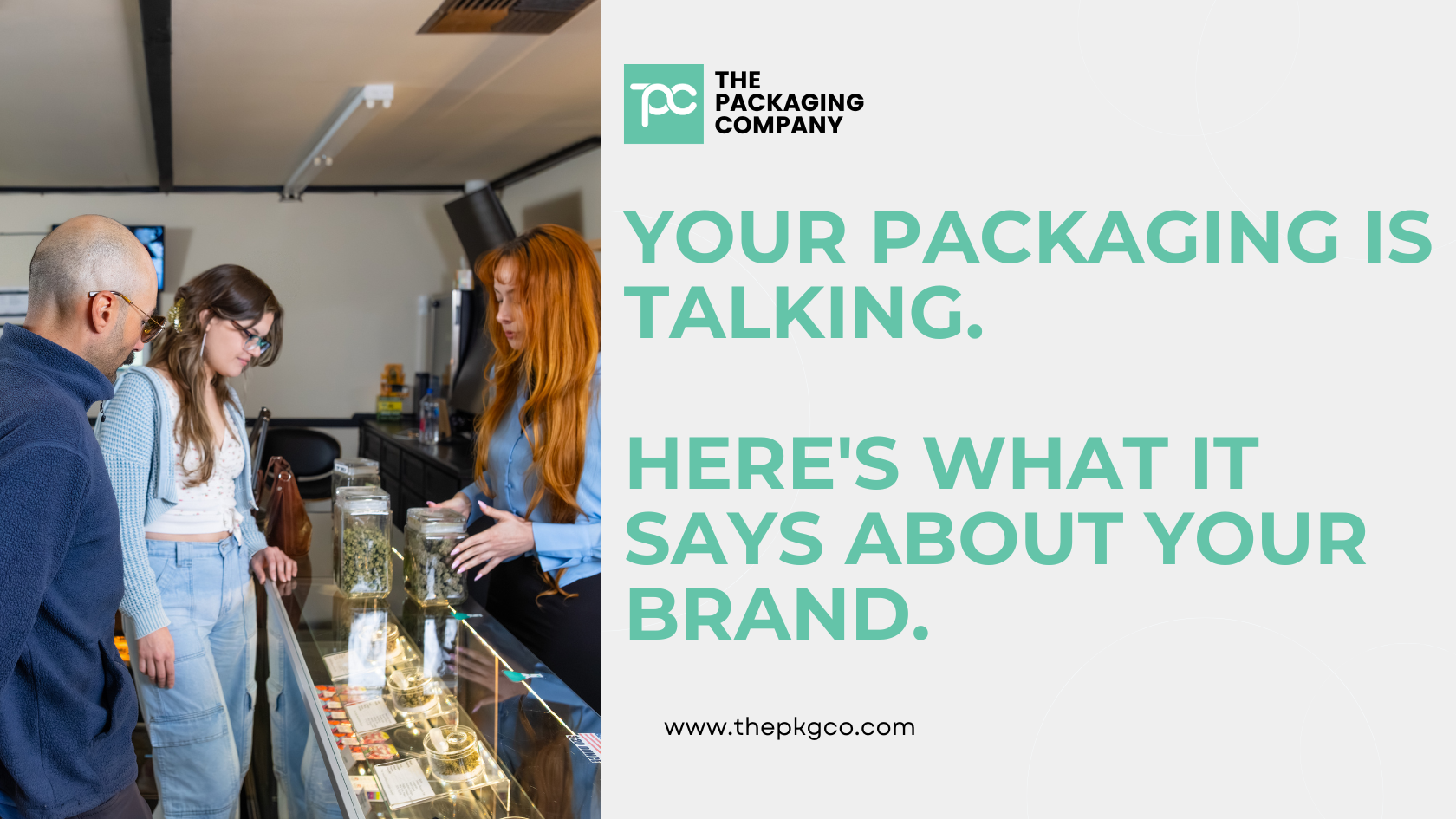
Before a customer reads your label, before a budtender says your name, before anyone has opened the package or smelled the product inside — your packaging has already communicated something. It happened in under a second. It happened without words. And it shaped every subsequent perception the customer has about what they’re about to buy.
This is not marketing theory. It’s sensory psychology — and it’s the operating system behind every purchase decision in every retail environment, including yours.
The brands that understand this build packaging that works for them at the shelf level. The brands that don’t are relying on the budtender to overcome what the package already said.
The Half-Second That Decides Everything
Consumer behavior research across retail categories consistently shows that purchasing intent forms within the first half-second of physical contact with a product. Not after reading the label. Not after hearing a description. In the moment of first contact — the visual impression, the weight, the surface texture, the sound of the closure.
In a dispensary environment, this plays out in a specific way. A customer approaches a display case. A budtender presents options. The customer picks one up. That half-second of physical engagement — before the customer has processed any information about THC content, strain genetics, or brand story — is where the purchase decision begins forming.
The package either builds toward a yes in that moment or it creates friction that the rest of the customer experience has to overcome. Great budtenders overcome a lot. But they’re working harder than they should be when the packaging creates the wrong impression first.
What Your Package Is Actually Communicating
Every physical property of a package sends a signal. Most brands think about these signals at the design level — logo, color palette, typography. Those matter. But the more fundamental signals come from the format and the material, not the design.
Weight communicates value. This is one of the most consistent findings in consumer psychology across categories. Products that are heavier feel more premium, more substantial, and more worth the price. A metal tin in a customer’s hand communicates something that a mylar bag — however beautifully printed — does not, because the weight is different. There is no design solution to the weight problem. It’s a format problem.
Closure sound communicates quality. The click of a well-engineered snap tin closing is a sensory signal. It communicates precision — that something was designed to fit together and does. The zip of a mylar bag communicates convenience. Both are honest signals. But they’re not the same signal, and at a $35 price point, the signal that communicates precision is doing more work for the brand than the signal that communicates convenience.
Surface texture communicates intentionality. A soft-touch matte surface on a bag signals that someone thought about what the package would feel like, not just what it would look like. Lithographic print on a metal tin signals the same thing at a higher level of investment. A glossy plastic surface signals speed and cost efficiency. Again, none of these is wrong in context. But they’re all communicating something, whether the brand intended them to or not.
Opening experience communicates brand investment. The moment a customer opens your package for the first time is the moment where packaging either delivers on the promise the exterior made or breaks it. A tin that opens to reveal a custom foam insert with pre-rolls seated upright and organized is a brand moment. A bag that opens to a pile of product shifting around inside is a different kind of brand moment. Both are communication. Both land differently.
The Mismatch Problem
The most damaging packaging situation is not cheap packaging. It’s mismatched packaging — a package whose signals are inconsistent with the price point, the product quality, or the brand positioning.
A $40 infused pre-roll in a mylar bag is mismatched packaging. The bag is communicating convenience, value, and disposability. The price is communicating premium, craft, and investment. The customer is receiving two contradictory signals simultaneously, and the resolution of that contradiction is usually skepticism about the price rather than excitement about the product.
The reverse mismatch is less common but also real: packaging that communicates premium for a product that doesn’t deliver it creates a customer who feels deceived after the first use. Packaging should match the product and the price, not aspirationally exceed them.
Getting this match right is not about spending more on packaging. It’s about choosing packaging that sends the right signal for what the product actually is and what the brand actually charges. A well-designed mylar bag is the right call for a value-tier flower SKU. A premium snap tin is the right call for a $35 infused pre-roll. The wrong call is using the format that’s cheaper without accounting for what that format communicates at the price point being charged.
The Signals You Can Control and the Signals You Can’t
Package design — the artwork, the colors, the typography — is the signal most brands invest in heavily. It’s also the signal with the most competition. Every brand has a designer. Every brand is working on visual differentiation. The visual language of premium cannabis packaging in 2026 is sophisticated, crowded, and increasingly difficult to stand out within.
The signals that come from format and material are less commonly competed on — and therefore offer more differentiation opportunity.
No amount of graphic design work changes the weight of a mylar bag. No label makes a plastic tube feel like a tin in someone’s hand. No typography changes the sound a closure makes when it engages. These are format properties, not design properties, and they’re available to any brand willing to make a different format choice than the default.
The brands creating the most consistent shelf presence in mature cannabis markets are the ones that have recognized this. They’re not just out-designing the competition. They’re out-formatting them. The tin in a sea of bags doesn’t have to be the best-designed tin — it just has to be a tin.
What This Means for Your Packaging Decision
If you’re currently in bags and the bags are working for your price point and your market position, keep running bags and invest in the design work that maximizes their shelf presence. There’s a right use case for every format.
If you’re in bags and your price point has grown past what a bag can communicate — or if you’re launching a new SKU that’s meant to signal premium — the format conversation is more important than the design conversation. Get the format right first. The design fills in what the format establishes.
If you’re about to launch your first SKU and you haven’t thought about what your package says before anyone reads it, think about it now. The half-second at the shelf is the moment everything you’ve built toward either lands or doesn’t. The packaging is the first word your brand says in that moment.
Make it the right one.
TPC’s CR Packaging Formats for Every Signal
TPC’s child-resistant packaging line spans the full range of brand signals available in regulated-market packaging.
For brands building toward premium positioning: CR snap tins with full lithographic decoration, embossing, and custom interior insert trays. The format that communicates precision, craft, and investment — in a customer’s hand, in a half-second, before they’ve read a word.
For brands where product visibility is the signal: CR glass jars that let the product make the first impression. Inert, premium, recyclable, and the right choice when the product inside is worth showing.
For brands where portability and familiarity are the signal: CR tubes in plastic, glass, or aluminum. Clean, functional, and available in configurations that elevate the format above the commodity standard.
For brands where cost efficiency and volume are the signal: CR mylar bags with full custom print in matte, gloss, or specialty finishes. The right call when the economics require it and the brand positioning supports it.
All formats are made to order, fully custom decorated, and backed by full certification documentation. MOQ starts at 5,000 units.
For the full CR packaging format overview, see our child-resistant packaging solutions guide. To start the format conversation with your product specs in hand, contact our team.
Frequently Asked Questions
Does packaging format really affect purchase decisions that much? Yes — and the research supports it across categories, not just cannabis. Weight, closure sound, surface texture, and opening experience all create measurable differences in perceived value and purchase intent. In a retail environment where a customer has multiple options and limited time, these subconscious signals are often more influential than conscious information processing like reading labels.
How do I know if my packaging is sending the right signal for my price point? Run a simple test: put your package next to your nearest competitor at a similar price point and evaluate both without reading the labels. Which one communicates the price more clearly? Which one would you pick up first? If the honest answer isn’t yours, the format or the design is doing the wrong work.
Is premium packaging worth the higher cost for cannabis brands? For SKUs at $25 and above retail, yes — the premium format supports the price rather than working against it, which makes the sale easier at retail and reduces the work budtenders have to do to justify the price. For value-tier SKUs, premium packaging is a misaligned investment. The format should match the price point.
What is the most underused premium signal in cannabis packaging right now? Weight. The tactile weight signal of a metal tin or a glass jar is the most consistent premium communicator in consumer psychology, and it’s the most format-dependent — you cannot achieve it through design alone. In a category where most products are in lightweight bags and plastic tubes, the weight signal of a tin creates immediate differentiation.
Can I use different formats for different SKUs in my product line? Yes, and many successful cannabis brands do exactly this — value-tier SKUs in bags, mid-tier in tubes, premium and infused SKUs in tins or glass jars. The format tiering communicates the product hierarchy to consumers before they’ve read a label, which is a more efficient communication system than relying on design alone to signal tier differences across a line.