



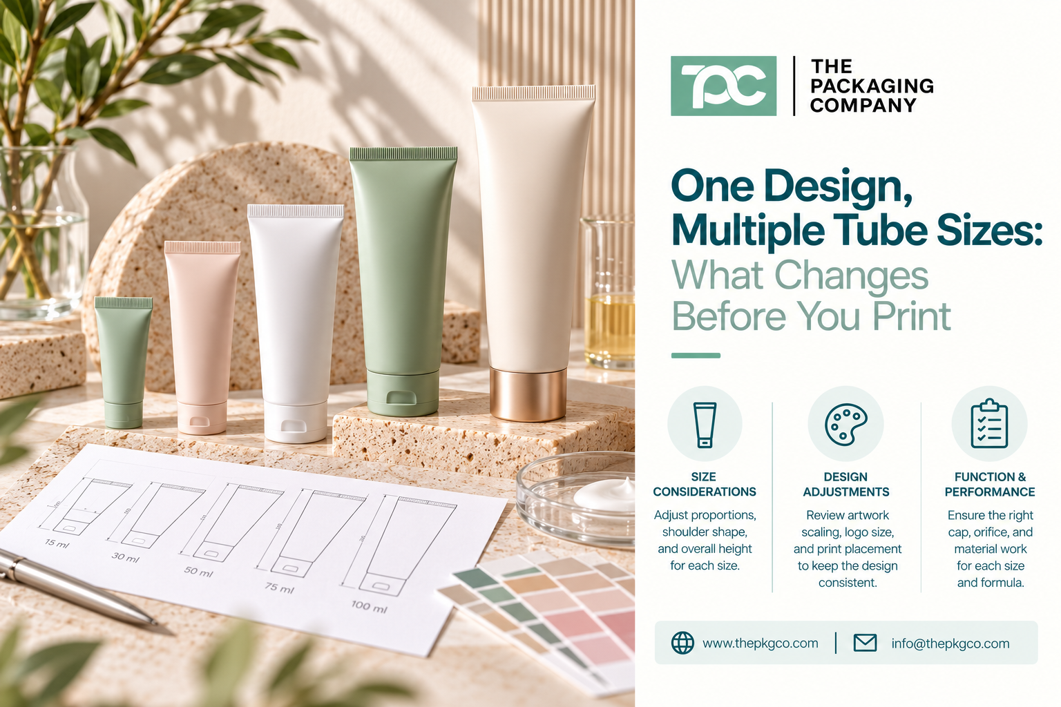
Printed cosmetic squeeze tubes often share the same branding across several product sizes, but the artwork cannot always stay the same. A design that works on a larger body lotion tube may need adjustments for a smaller hand cream or facial treatment tube. The logo, product name, and important labeling details still need to be clear and well positioned on each size.
Tube diameter, body length, cap style, and the tail-sealing area can change the usable print space and how the finished design looks. Simply shrinking an existing artwork file can leave text crowded, graphics poorly placed, or important information too close to production-restricted areas.
For beauty brands developing printed cosmetic squeeze tubes in multiple sizes, the goal is to maintain a consistent brand identity while preparing the right layout for each tube. The following considerations explain where artwork needs to change before printing. You can also explore The Packaging Company’s custom squeeze tube packaging options.
The Same Design Is Not Necessarily the Same Print File
When a brand says, “Use the same design on every tube,” it usually means maintaining the same visual identity: logo, colors, type style, hierarchy, and overall brand presentation.
For production, however, each tube specification may require its own artwork file or manufacturer-approved layout. Even if all tubes share the same nominal material and decoration style, a different diameter or length may change how the design wraps around the container and how close text sits to the shoulder, cap, or tail.
For example, a three-product skincare range could include a small targeted-treatment tube, a mid-size hand cream tube, and a larger body lotion tube. All three can look coordinated, but the brand may need to rearrange supporting text and adjust the logo proportions on the smaller package.
The key distinction: Keep the design system consistent while adapting the production artwork to each actual tube.
1. Start With the Exact Tube Dimensions and Supplier Artwork Template
Tube capacity alone does not define the printable surface. Two tubes with the same fill volume can have different diameters, body lengths, shoulder shapes, and closure configurations.
Before a designer creates final files for multiple SKUs, confirm which physical tube has been selected for each one.
Ask the packaging supplier for the applicable specifications and any approved template for:
- Tube diameter and relevant body dimensions
- Body length and shoulder transition
- Usable print or decoration area
- Required safe zones or production tolerances
- Any seam, registration, or design alignment limitations that apply to the construction
- Applicable tail-sealing or closing area exclusions
- Cap or applicator configuration where it affects the intended front-facing presentation
Do not assume an online mockup or a designer-created rectangle represents the manufacturer’s usable print area. The actual layout restrictions depend on the selected tube construction and decoration process.
What changes with size? Not merely the scale of the design. The usable width, height, safe area, and visual proportions may all change.
2. Decide What Must Stay Consistent Across the Line
A packaging family does not require identical positioning down to the millimeter. In fact, rigidly repeating every coordinate can make the smaller package look crowded or the larger one look empty.
Instead, define a short set of brand elements that must remain recognizable across the entire tube line.
- Logo treatment: Relative visual prominence and approved artwork version
- Color system: Primary brand color, product-specific accents, and agreed references
- Typography: Consistent type family and rules for hierarchy
- Information structure: Placement priorities for product name, function, and other required information
- Overall visual balance: A consistent design language, even when the layout is adapted
Then identify the elements that may need to vary by size, such as supporting copy, line breaks, spacing, information panel position, or the relative scale of a decorative graphic.
A small treatment tube may need a simpler front panel than a large body care tube. It is better to plan those differences than to shrink every element until it becomes hard to read.
3. Rework Logo Placement and Text Hierarchy for Smaller Tubes
Designers frequently begin with the most spacious package because it gives the brand room to develop the visual identity. The challenge appears when the design needs to fit a narrower tube.
If the entire artwork is scaled down proportionally, the logo can lose presence, the product name may become difficult to distinguish, and secondary information may become too small.
Consider the hierarchy from the customer’s perspective:
- Can the customer identify the brand?
- Can they quickly recognize which product they are holding?
- Are essential directions, warnings, and other applicable labeling details legible in the intended market?
- Is the layout still visually balanced after the mandatory information is included?
The brand’s regulatory and artwork teams should determine applicable labeling requirements and readability criteria. The packaging supplier can help identify the available print area and the limitations of the selected construction.
Where the smaller tube cannot accommodate the desired presentation and required information, the brand may need to revise the design, choose another tube specification, or review an appropriate secondary-labeling solution rather than forcing unreadable copy onto the container.
4. Check How Artwork Wraps Around Different Tube Diameters
A design that looks centered on a flat artwork file may feel different when printed on a round tube and viewed from the front.
As the tube diameter changes, the curvature and visible section of the decorated surface also change. This can affect how a wide logo, long product name, border, illustration, or color block appears to the customer.
Brands should evaluate whether key front-panel elements remain visible in the intended viewing position and whether copy that continues around the sides is properly planned.
In particular, review:
- Whether the main logo or product name extends too far toward the side edges
- Where front-panel design transitions into rear-panel instructions
- Whether full-coverage colors and pattern edges meet the supplier’s process requirements
- Whether small text remains readable on the curved surface
- Whether any visible seam or manufacturing feature affects the artwork placement for the selected tube construction
Do not assume the same flat spacing translates into the same visual result across different tube diameters.
5. Plan Around the Shoulder, Cap, and Tail-Sealing Area
A cosmetic squeeze tube is not a perfectly rectangular printing surface. Its shoulder and closure create one end of the finished package; the tail is typically filled and sealed by the filling partner in applicable tube configurations.
That physical construction matters for artwork placement.
Near the Shoulder and Cap
Important graphics may need to be kept away from curved or restricted areas near the shoulder. The cap style can also change the perceived proportions of the package: a wide flip-top cap may create a different visual balance from a slim screw cap or precision applicator.
If front-to-cap alignment matters to the brand, confirm how the specific closure is assembled and whether a consistent orientation is achievable. Do not assume every closure can be positioned identically after filling.
Near the Tail
The tail area should be reviewed against the actual filling and sealing process. The filler must confirm that printed elements, text, codes, and designated artwork zones will not conflict with the relevant seal or closing requirements.
Brand teams should also consider how the filled tube will be displayed. If a tube is intended to stand cap-down, the artwork must read correctly in that orientation; a different retail presentation may require a different layout decision.
These constraints are tube- and process-specific. Obtain the applicable artwork specifications and coordinate the final production plan with the supplier and filler.
6. Keep Colors Consistent Without Assuming Identical Printed Results
Brands often want the same signature color across every size. The color target may be shared, but the visual result can vary with substrate, surface finish, printing process, artwork coverage, and production conditions.
A narrow tube and a large tube may also appear different even if they use the same nominal color, simply because the amount of visible color is different.
For a multi-size range, brands should define the approved color references and communicate whether consistent visual matching between SKUs is a priority. Where different tube structures or finishes are specified, they should ask the supplier what variation is achievable and how color will be evaluated.
Using a common color reference is helpful, but it does not guarantee mathematically identical appearance across different materials or printing processes.
Instead of approving color based only on a monitor, incorporate it into the agreed packaging approval and PPS review process.
7. Give Every Tube Size Its Own Artwork and Revision Reference
When multiple products share similar packaging, a production mix-up can be as simple as the wrong artwork revision being associated with the right tube size.
For instance, a brand may have three cream products in the same color family and two tube volumes. If the project file only says “approved cream tube artwork,” it may not be clear which file belongs to which SKU.
A simple version-control record helps:
| Item to record | Example of what to document |
|---|---|
| Product and SKU | Hand cream — 50 mL — SKU HC-50 |
| Tube specification | Supplier-approved tube and cap reference |
| Artwork reference | HC-50-print-v3.pdf |
| Design version | Approved brand design / product information revision |
| Color and finish | Agreed references and acceptance criteria |
| Approval stage | Artwork review pending / PPS approved |
The example is illustrative; teams should use their own actual part numbers, file names, and approved specifications.
For multi-SKU programs, make sure each size and unique printed variant can be identified independently. Do not assume that approving one SKU automatically approves the others.
8. Understand When Artwork Changes Create a New Production Variant
A small design change may seem minor from a creative perspective but still affect print setup, production documentation, quantity planning, and cost.
Different tube sizes, colors, printed messages, and artwork revisions can require separate manufacturing or print-run arrangements. Shared branding does not necessarily mean those quantities can be combined into one production minimum.
TPC’s general squeeze tube MOQ is 10,000 units, with project-specific requirements to be confirmed. Brands ordering several printed variations should ask which specifications and artwork changes count as separate SKUs or print runs.
For a closer look at the commercial side of multi-SKU tube planning, see how beauty brands plan squeeze tube MOQ, SKU groups, and reorders. This article is focused on artwork adaptation rather than ordering strategy.
9. How TPC’s Sample and PPS Process Fits Multi-Size Tube Artwork
At TPC, stock packaging samples can help brands evaluate available formats, physical sizes, and component configurations before committing to a custom order. Stock samples are not intended to confirm the final customized artwork.
For custom orders, the pre-production sample (PPS) is provided after the order is placed. The brand reviews the agreed production configuration, including the applicable customization, before bulk manufacturing.
For a program with multiple printed tube sizes, identify which designs and configurations require their own PPS approval. Do not assume one approved tube represents every diameter, size, material, cap, or artwork version.
After PPS approval, TPC’s typical manufacturing lead time for many custom packaging projects is approximately 90 days, subject to the order and excluding any additional shipping time. The schedule should also allow for artwork preparation, technical review, order placement, and PPS approval before that production period begins.
For more detail about what a PPS does and does not approve, review stock samples versus pre-production samples.
Multi-Size Cosmetic Tube Artwork: A Practical Review Table
Before approving the artwork set for a range of tube sizes, verify that the following decisions are made for each relevant SKU.
| Review item | What to confirm across tube sizes |
|---|---|
| Tube dimensions | Actual diameter, body length, and supplier-approved artwork area for each size |
| Brand identity | Which logo, color, and layout conventions must remain consistent |
| Logo and text | Readable product names, information hierarchy, and required labeling space |
| Curvature and wrap | Front-panel visibility, side transitions, and decoration boundaries |
| Shoulder, cap, tail | Relevant safe zones, display orientation, and filling/sealing constraints |
| Color | Approved references and any acceptable process- or material-related variation |
| Artwork control | Separate file name, revision, tube reference, and SKU identity |
| Post-order approval | PPS reference and approval status for each required configuration |
That review should involve design, procurement, the packaging supplier, and the relevant filling or quality teams. The supplier’s technical artwork requirements take precedence over generic mockup dimensions.
Build a Consistent Tube Line Without Forcing Identical Artwork
The most successful multi-size tube lines recognize that consistency comes from repeatable design principles—not from shrinking the same file for every container.
Use the same recognizable visual language, but allow the layout to respond to the actual tube shape and amount of information required. Confirm the applicable artwork areas early, manage each production file by SKU, and treat post-order PPS approval as a distinct decision from choosing a stock packaging sample.
The Packaging Company supports skincare, cosmetics, beauty, and personal care brands sourcing custom cosmetic squeeze tubes. For help reviewing tube specifications and multi-size customization options, contact TPC with your approximate sizes, intended quantity per SKU, closure preferences, and brand artwork direction.
FAQ: Printing One Design Across Multiple Tube Sizes
Can I print the same artwork on 30 mL and 100 mL cosmetic tubes?
You may be able to use the same branding and design elements, but each tube specification may require its own properly adapted print file. Confirm the usable artwork area and layout constraints for both sizes with the supplier before approval.
Why does the logo look different on a smaller squeeze tube?
A smaller tube may have less printable space and a different diameter or visible front-facing area. A logo scaled directly from a larger design can lose visual balance or extend too far around the sides. The artwork may need to be repositioned or resized for that specific tube.
Do I need separate artwork approval for each printed tube size?
Different tube sizes or artwork configurations should be identified and reviewed individually. The supplier and brand should agree which variations require separate approval records and PPS references.
Does TPC provide a separately decorated sample before ordering?
TPC’s normal process is to review available stock samples before ordering and provide the pre-production sample (PPS) after an order is placed. The PPS is the reference used for approval of the agreed customized configuration before bulk manufacturing.
Does one printed design mean multiple sizes share the same MOQ?
Not automatically. Different tube specifications and printed variants can require separate production quantities or print runs. TPC’s general squeeze tube MOQ is 10,000 units, and exact requirements should be confirmed for the project.