

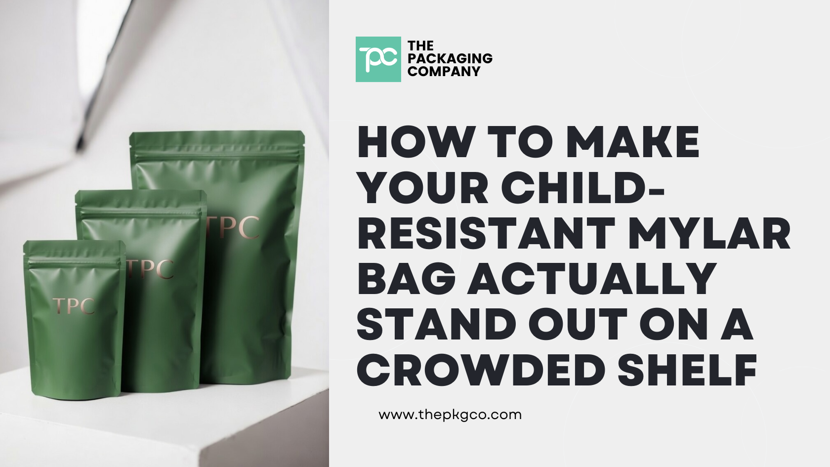
Walk into any cannabis dispensary in a mature market right now and count the child-resistant mylar bags. They’re everywhere — every price point, every brand tier, every category. Flower, pre-rolls, edibles, concentrates. The bag has become the default packaging decision across the industry, and that ubiquity is exactly the problem.
When every brand on the shelf is in a bag, the bag stops being a brand asset and starts being a commodity signal. The differentiation work falls entirely on design, print quality, and execution — and while those things matter, they have a ceiling. You can only do so much with a flexible substrate before the format itself becomes the limitation.
That said, bags are a real business decision for a lot of brands, and if you’re going to run bags, you should run them as well as possible. This guide covers what actually moves the needle on shelf presence for CR mylar bags — and where the ceiling is when you hit it.
The Baseline Problem: Why Most CR Bags Look the Same
The CR mylar bag market is dominated by a relatively small number of print suppliers running similar film constructions with similar closure hardware. When every brand is sourcing from the same short list of suppliers, the physical substrate is essentially identical across competitors. You’re differentiating entirely on what’s printed on the surface.
That’s a narrow lane. And it gets narrower every time a new brand enters the market with a well-designed bag, because the visual language of “premium mylar bag” has become a category aesthetic rather than a brand signal. Bold gradients, metallic finishes, embossed logos, holographic elements — these were differentiators two years ago. In 2026, they’re table stakes.
None of this means bags can’t look good. It means the work to stand out on a bag is harder than most brands budget for — and the tools available to do it are more limited than most brands realize going in.
What Actually Moves the Needle on Bag Shelf Presence
Finish Selection Is Your First Real Decision
The finish of the bag — matte, gloss, soft-touch, metallic, specialty — is the first thing a consumer registers before they’ve read a word. Most brands default to soft-touch matte because it reads as premium and has become the standard for mid-to-high-tier cannabis. Which means soft-touch matte is now the default aesthetic of the entire category.
This creates an opportunity in contrast. A clean, high-gloss bag in a sea of matte competitors creates visual separation without any other design work. The opposite is also true — in a market segment where glossy bags dominate, a restrained matte bag with minimal design can read as more sophisticated than everything around it.
The decision should be made against your specific competitive set, not against a general premium standard. Walk your target retail environment and evaluate what’s actually on the shelf. Choose the finish that creates contrast with your nearest competitors, not the one that matches the general industry aesthetic.
Specialty finishes — soft-touch velvet, tactile spot UV, holographic panels, pearlescent metallic — are available and can create genuine differentiation at the point of touch. The limitation is that they tend to add cost and lead time, and their effectiveness depends entirely on how the rest of the design integrates with the finish. A holographic panel on a busy, overdesigned bag reads as noise. The same finish on a restrained, confident design reads as intentional.
Print Quality Is Where Cheap Bags Get Exposed
Rotogravure printing — the premium standard for mylar bag production — produces consistent, saturated color with sharp edge definition across long runs. Digital printing is more accessible at lower quantities but shows its limitations in solid color coverage, gradient accuracy, and registration precision.
If your design relies on dense solid color panels, precise Pantone matching, or fine detail work, the print process matters as much as the design itself. A design that looks perfect in Adobe Illustrator will look different on rotogravure versus digital, and different again on matte versus gloss substrate.
Before finalizing design for production, request a physical print proof on the actual substrate and finish you’ve specified. Evaluate it under retail lighting conditions — not in your studio under optimal lighting — because that’s the environment where it has to win.
The Structural Presentation Problem
Flat bags have a fundamental shelf presence issue: they don’t stand up on their own in a retail-friendly way unless they have a gusset (stand-up pouch format). And even stand-up pouches depend on the fill weight to hold their structure — an underfilled bag droops and collapses, which reads as cheap regardless of how strong the print quality is.
Confirm that your fill weight is matched to the bag size such that the filled bag holds its shape on a flat surface. An eighth bag that’s actually full reads differently than an eighth bag with significant dead space at the top. This sounds obvious but is frequently overlooked when brands select bag sizes based on volume specs rather than what the filled bag looks like at retail.
For brands using flat (non-gusset) bags, the shelf display context matters more than the bag design. A bag that lies flat on a shelf behind glass needs a display stand or tray to present face-forward. Factor this into your retail execution strategy — great bag design is invisible if the bag is sideways in a bin.
The Back Panel Is Wasted Real Estate
Most brands treat the back of the bag as a compliance dump — required legal text, nutrition facts if applicable, track-and-trace QR codes, and a wall of warnings. This is understandable given how much mandatory content cannabis regulations require, but it represents a missed opportunity.
The back panel is the surface a consumer spends the most time reading. It’s where brand voice lives — a strain story, a cultivation note, a brand philosophy statement, anything that creates a connection between the product and the person holding it. Brands that use the back panel only for compliance content are leaving a brand touchpoint on the table.
Work with a designer who understands compliance label requirements for your specific state and can design a back panel layout that satisfies regulatory content requirements while still telling a brand story in the available space.
Where the Ceiling Is
Here’s the honest version of what bags can and can’t do for brand presence.
What bags do well: accessible cost-per-unit at scale, flexible sizing across product weights, full-surface print with strong visual impact potential, broad consumer familiarity, and effective product protection when the barrier construction is right.
Where bags hit their ceiling: tactile premium signal, structural integrity on shelf without display support, sensory brand experience at opening, perceived value communication, and post-use brand presence. A consumer does not keep a mylar bag after the product is gone. The packaging’s brand impression ends the moment it’s empty.
The ceiling on bag differentiation is a design ceiling. You can make a better-designed bag than your competitors. You cannot make a bag that feels fundamentally different from every other bag on the shelf, because the format itself communicates flexibility, cost efficiency, and disposability regardless of what’s printed on it.
For brands at a price point where that ceiling is fine — value-tier flower, high-volume SKUs, entry-level pre-roll formats — bags are the right call and the differentiation work described above is exactly what to focus on.
For brands whose product positioning has outgrown what a bag can communicate — premium infused formats, high-price-point flower, limited edition releases, anything where the packaging needs to signal that the product inside is worth more than the bag suggests — the format conversation is the more important one.
When the Format Is the Problem
The brands generating the most consistent shelf presence in mature cannabis markets right now share a format characteristic: they’re not in bags.
The move that’s happening — particularly in California and other markets where consumers have been buying legal cannabis long enough to have opinions — is toward rigid packaging. And specifically, toward CR tins.
A premium CR snap tin does things a bag cannot do regardless of design execution:
It has weight. The moment a consumer picks up a tin, the physical mass communicates quality before they’ve looked at the label. You cannot replicate that signal in a flexible substrate.
It has a closure experience. A properly engineered CR tin closes with a satisfying snap that communicates precision and intentionality. That sensory moment is a brand touchpoint. A zip closure on a mylar bag is functional. A snap tin closure is experiential.
It has post-use life. Consumers keep tins. They use them for storage, organization, travel. Every day a branded tin sits on a consumer’s desk or nightstand is a brand impression that costs nothing after the initial purchase. Bags get thrown away.
It controls the shelf conversation. In a dispensary display case where 80% of products are in bags, a single well-decorated CR tin creates immediate visual separation that no amount of bag design can replicate. The format is the differentiation before the design even registers.
The transition from bag to tin is not always the right move — it comes with higher per-unit cost and MOQ considerations. But for brands whose product and price point have already outpaced what a bag communicates, the format question is worth asking seriously before investing further in bag design optimization.
TPC’s CR Packaging Options Across Both Formats
TPC carries both CR mylar bags and a full range of CR tins — so the format decision doesn’t have to be binary, and you don’t have to switch suppliers to test both.
CR Mylar Bags (SKU: 843-BAG-CR) — ASTM F1272 certified, available in 1g through 28g, full custom print in soft-touch matte, gloss, metallic, and specialty finishes. MOQ 5,000 units.
CR Snap Tins — engineered snap closure, certified CR, full lithographic decoration, custom insert tray configurations. Standard (74mm × 58mm × 20mm) and extended (95mm × 57mm × 20mm) formats. MOQ 5,000 units.
CR Tin Jar — 90ml wide-mouth format for infused pre-rolls, edibles, and topicals where product presentation inside the package is part of the brand experience.
For brands evaluating the full CR packaging landscape, see our child-resistant packaging solutions guide. For the pre-roll format comparison specifically, our pre-roll packaging guide breaks down how bags, tubes, tins, and glass jars compare across compliance, brand experience, and cost-per-unit.
To discuss format options and get samples of both bags and tins, contact our team.
Frequently Asked Questions
How do I make my CR mylar bag look more premium than competitors? The highest-leverage decisions are finish selection (choose contrast against your competitive set, not industry default), print process (rotogravure for consistent quality at volume), structural fill weight (match bag size to fill so the product holds shape on shelf), and back panel design (use it for brand storytelling, not just compliance dumping). Physical print proofs on your actual substrate under retail lighting are essential before committing to production.
What finish is best for a premium cannabis mylar bag? It depends entirely on what your nearest competitors are doing. Soft-touch matte has become the category default for mid-to-high-tier cannabis, which means it no longer creates differentiation in most markets. Evaluate your specific competitive shelf environment and choose the finish that creates contrast — whether that’s high-gloss against a matte-dominated set, or restrained matte against a metallic-heavy category.
Are child-resistant mylar bags recyclable? Standard multi-layer CR mylar bags are not recyclable in single-stream municipal programs because the dissimilar bonded film layers cannot be separated in standard recycling infrastructure. PCR content bags and mono-material flexible constructions are available for brands with sustainability requirements, though each involves trade-offs in barrier performance or print quality.
When does it make sense to switch from bags to tins for cannabis packaging? When your product price point and brand positioning have outpaced what a bag can communicate. Bags signal cost efficiency and flexibility regardless of design quality. Tins signal premium, precision, and brand investment. If you’re selling infused pre-rolls at $25–$40+, limited-edition drops, or high-end flower where the packaging is part of the brand experience, the format conversation is more important than further investment in bag design optimization.
Can I use both bags and tins across different SKUs? Yes, and this is a common approach for brands with tiered product lines. Value-tier and high-volume SKUs in bags. Premium, limited-edition, or infused formats in tins. TPC carries both formats and can supply both from the same supplier relationship, which simplifies procurement and documentation management across your packaging line.
What is the MOQ for CR mylar bags and CR tins at TPC? Both formats start at 5,000 units. Pre-production samples are available for both before any production commitment. Contact TPC to discuss format options and get samples for side-by-side evaluation.